By Alexander Almgren
Pop Mixing Data: The Records That Broke Out Didn't Push the Beat
We measured 5,246 pop releases and compared the 450 whose artist at least doubled their Spotify monthly listeners within 90 days against the 4,796 that didn't. The breakouts hit softer (beat strength 1.19 vs 1.23, p = 0.006), moved less (danceability 1.12 vs 1.16, p = 0.001) and had fewer events per second (onset rate 3.0 vs 3.5, p = 0.001). Their harmonic picture was cleaner too (dissonance down, p = 0.003). And when a softer beat lined up with an airy top and a rich spectrum, the breakout rate went from 8.6% to 19.9%. Measured audio, not forum folklore, from the same pipeline that runs our Sonic Analyzer.
This is the second post off the same lane-by-lane pass through our breakout data, the dataset behind the tonal balance study and the loudness study. The R&B post found one frequency band that separated the records that grew from the ones that didn't. Pop gave me something different. Not one band. Four rhythm and texture measurements, all pointing the same direction, and the single cleanest combination in the whole study.
I want to say up front what this is not, because the headline invites a misread. It is not "pop records that break out have weak drums." I'll get to what I actually think it is. First the numbers.
What These Measurements Are
Three of the four are about rhythm, and they're easy to confuse, so plainly:
Onset rate is a count. Tap a finger on the table once every second. That's an onset rate of one. Tap it five times a second and it's five. The analyzer does the same thing to the whole record: every time a new sound starts, a hi-hat tick, a vocal chop, a stab, a snare, it counts one, and then it averages how many start each second. Around three is a pop record with room in it. Four or five is a busy one. It says nothing about how loud or how good. Just how many things are starting.
Beat strength is how much the beat shouts. A kick on every beat with a clap that lands hard on two and four, every bar, the same, reads high. A record where you can feel the pulse but the drums aren't announcing it, where the bass and the singer are carrying the time, reads low. It's not how loud the drums are. It's how much they insist.
Danceability is how steady and how bouncy the pulse is, in one number. A steady bounce you could walk to reads high. Loose, slow or drifting reads low.
Dissonance is how much the notes rub against each other. A clean chord over a clean bass is smooth and reads low. When overtones clash and things are fighting a little, it reads high.
The analyzer measures all four from the audio. No metadata, no genre tag, no opinion. Just the file.
The Data
The pop lane here is 5,246 releases from August 2025 through April 2026 where we had the artist's Spotify listener history on both sides of the release date. A breakout means the artist at least doubled their monthly listeners within 90 days, against a pre-release baseline of at least 500. That's 450 records, 8.6% of the lane.
Breakouts against everyone else:
| Breakouts (450) | Rest (4,796) | p | |
|---|---|---|---|
| Beat strength | 1.19 | 1.23 | 0.006 |
| Danceability | 1.12 | 1.16 | 0.001 |
| Onset rate (events/sec) | 3.0 | 3.5 | 0.001 |
| Dissonance | 0.055 | 0.059 | 0.003 |
| Dynamic range | 25.6 dB | 25.9 dB | 0.0002 |
Every one of those is the breakouts measuring lower. Calmer pulse, fewer events, cleaner harmony, slightly tighter dynamics. The same story from five directions.
As rates, splitting the lane into thirds:
| Softest third | Middle | Hardest third | |
|---|---|---|---|
| Beat strength | 9.9% broke out | 8.8% | 7.0% |
| Danceability | 9.7% | 9.3% | 6.7% |
| Onset rate | 9.5% | 9.6% | 6.5% |
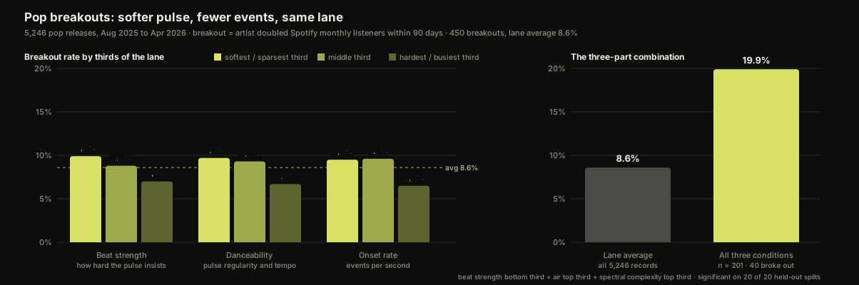
The hardest-hitting third of pop breaks out at about seven in a hundred. The softest third, about ten in a hundred. Same for the busiest third against the sparsest. That's not a huge gap on its own. It's a consistent one, and it runs against the instinct most people bring to a pop mix, which is that more drive means more chance.
It's Not That Pop Is a Soft Genre
I checked this, because the obvious explanation would be that pop as a whole just hits softer than the lanes around it. It doesn't, particularly. The pop lane's median beat strength is 1.22. Hip-hop sits at 1.48, electronic at 1.38, R&B at 1.29, rock at 1.16, folk and country at 1.15. Pop is in the middle of the pack.
So the lane isn't soft. The records inside the lane that grew were softer than their neighbours. And the ones that pushed the hardest grew the least.
The Combination
A single measurement leaning 1.4 times is a lean. What I actually went looking for is whether things land together on the records that break, because that's how it goes at my desk. I'm not setting one knob.
I tested combinations of two and three conditions inside the lane, each condition being "top third" or "bottom third" of the lane on one measurement. Then, because searching thousands of combinations turns up winners whether or not they're real, every candidate was re-fitted and re-scored on twenty random halves of the data it had never seen. Only combinations that held on those held-out halves are reported.
The strongest one in pop, and the strongest one in any lane:
- Beat strength in the bottom third (1.16 or less; the lane median is 1.22)
- Air in the top third (more than 18.4% of spectral energy above 8 kHz; lane median 15.8%)
- Spectral complexity in the top third (0.087 or more; lane median 0.081), meaning a richer, more detailed spectrum
201 records met all three. 40 of them broke out. That's 19.9% against the lane's 8.6%, about 2.3 times, and it was significant on every one of the twenty held-out splits. Nothing else in the study did that.
Here's the part I find genuinely interesting. Air on its own predicts nothing in pop (p = 0.48). Spectral complexity on its own predicts nothing (p = 0.87). The best single ingredient in that recipe, beat strength, gets you about 1.15 times. Together they get you 2.3. The combination isn't three small effects added up. It's a shape: a record that's soft in the pulse but open and detailed on top. That shape converts.
Read it as English and it's a record with a lot going on in the air and the texture, and not much insisting in the beat.
The Catches
I'd rather you hear these from me than work them out later.
Breakout is measured at the artist, not the track. If an artist doubled their listeners in the 90 days after a release, that release gets the credit. The growth can come from a playlist add, a tour, a sync, a short-form moment, or an entirely different song. It's a real-outcomes yardstick, not proof of cause.
The listener history comes from Chartmetric, and data is data. Sometimes the data can be wrong at the source. Their pulling system doesn't always work, or it needs updating, and that's why I lean on my own systems where I can. The breakout label in this study is only as good as those snapshots. I don't think it's wrong in aggregate across 5,246 records. I'd be lying if I said every one of them was right.
Size and money were checked, and they don't explain it. Doubling your audience is far easier from 800 listeners than from 300,000, and signed artists double more often than unsigned at the same size. Both are true here and both are large. So the combination above was re-scored only among pop artists with more than 10,000 listeners (it held, 1.7 times) and only among unsigned pop artists (it held, 2.2 times). This is not a story about who had a budget.
The genre tags cover about 45% of tracks. We classify by the track-level tags that come down with each release, mapped through our genre taxonomy, and tags that don't resolve fall out rather than getting guessed. 5,246 is what's left in the pop lane after that, which is the biggest lane in the study. 450 breakouts and a combination cell of 201 records are numbers I'd stand behind.
Correlation. Nothing here says that softening the beat makes a record grow. It says the pop records that grew had softer beats. Those are different sentences and I'm only standing behind the second one.
What This Looks Like at the Desk
I'm not going to turn a dataset into a preset, and I'm not going to tell you to pull your drums back, because I don't believe that's what this is.
I always think the drums go in front of the music. Whether they're hard drums or soft drums, that is integral to the sound, and we can move them whichever way you want in order to get the feel you want. Softer hits, it doesn't matter, because they will still transcend and move through the track the way I produce and mix. Mixing into compression is what lets me dial in that intensity and feel without it sounding overdone. The pulse can be enormous without the transients insisting on it. That's a mix decision, not a drum decision, and I suspect it's a big part of what this data is actually measuring: records where the intensity is carried by the mix, not hammered by the hits.
The busyness number is the one I'd take most seriously. When a pop record is too busy, I just try and make sure the vocal is front and center. Sometimes that's rolling off the things that are getting in the way on an EQ level, which is the surgical approach. If that doesn't do it, I'll chop, which is the arrangement level and a little more aggressive. Either way I'm trying to serve the song, the lyrical content, the narrative, what we're trying to express. Fewer events per second usually means the singer has room.
And on the conversation itself: I will never not give an artist what they want. If they want more bounce, more drive, I can absolutely give them that. I will say if I think it's too much, and I'll say we should consider this. But you are the artist, and this is your song at the end of the day. What this data changes is what I say in that moment. I used to say "I think it's too much" and mean it as taste. Now I can say it and mean it as a number, and then hand the decision back where it belongs.
In this lane, in this data, the records that grew were the ones that didn't push. The intensity was still there. It just wasn't in the hits.
What To Do With This
If you make pop, pull up your mix and listen to where the intensity is coming from. If the answer is the transients, the snap of every hit, there's another way to get there that the growing records seem to be using more often. If you want to know where your record actually sits against the pop records that converted, beat strength, onset rate, air, the same measurements this study is built from, run it through the Sonic Analyzer; the scan is free and takes about a minute. And if the scan says the beat is doing all the work and you'd rather have a second pair of hands on the mix, here's what mixing and mastering cost, itemized honestly, or get a number calibrated to where you are from the rate calculator.

Multi-platinum producer & engineer — 19 Billboard Top 20 albums, 3.3B+ streams. Every project at Freshly Baked Studios is mixed and mastered by him personally.
Meet Alexander →Ready to Make Something Better?
Get a custom quote in 90 seconds — or book a free 30-min consultation.
19 Billboard Top 20 albums · 3.3B+ streams · Apple Digital Masters certified