By Alexander Almgren
The Signature Sound Myth: The Records That Broke Out Sat Closer to Their Genre, Not Further
We measured 51,868 releases and compared the 3,860 whose artist at least doubled their Spotify monthly listeners within 90 days against the 48,004 that didn't. The breakouts sat closer to their genre's tonal centre, not further from it. Higher on the analyzer's genre-positioning score (0.710 vs 0.697, p = 6e-11), lower on tonal deviation (0.409 vs 0.418, p = 6e-5). The third of all records that sits furthest from its genre broke out 6.6% of the time; the third closest, 8.3%. And when we searched every lane for the combinations of measurements that predicted growth, "sits in its genre" was the ingredient that kept showing up. Measured audio, from the same pipeline that runs our Sonic Analyzer.
I'll say what this post is not before I say what it is. It is not an argument for sounding generic. I've spent 20 years making records that sound like me, and I'll get to how that squares with this data, because it does. What this post is about is a specific idea I hear from artists, that the record that breaks out is the one that sounds like nothing else, and what the numbers say about that idea. They don't support it. Anywhere.
Where This Came From
This one is the thread that ran through everything else. We've been going lane by lane through the breakout data, the same dataset behind the tonal balance study, and each lane gave up its own finding: R&B carried more low-mid, pop pushed the beat less. Different answers in different rooms. But one measurement showed up in the recipes for lane after lane, and it wasn't a frequency band or a rhythm number. It was a score for how much a record sounds like its own genre.
In electronic music it was in all four of the combinations that survived validation. In rock, two of four. It carried the world-music result. And in one cell, folk and country records the analyzer reads as tender, it produced the single largest effect anywhere in the study. Four lanes, four separate analyses, one ingredient. That's the kind of thing you write down.
What the Two Scores Actually Measure
Two numbers do the work here, and both are worth understanding plainly, because "sounds like its genre" could mean a lot of things and here it means something narrow.
Tonal deviation is the narrow one. The analyzer takes four bands, bass (60 to 250 Hz), low-mid (250 to 500), mid (500 to 2k) and high-mid (2 to 4k), and for each one it looks up where this record sits inside its genre's range, as a percentile. Then it measures how far that is from the middle, the 50th, averages the four and scales it to run from 0 to 1. A record scoring 0 is in the dead centre of its genre on every band. A record near 1 is at the edge on every band. If you've ever put a tonal balance meter on your master bus and eyeballed your curve against a genre target, this is that, measured, on the four bands that matter most.
Genre positioning is the broader one. It's the analyzer's overall genre-fit score, 0 to 1, built the same way but across every measurement it takes: for each one, how far the record sits from its genre's median, averaged. Tonal balance is part of it. So are loudness, energy, dynamics, tempo and the rest. High means the record measures like other records in its lane, across the board. Low means it measures like something else.
Neither one knows anything about the song. Neither one hears a melody, a lyric, a voice, a feel. That matters for what comes later.
The Data
Everything below uses the same yardstick as the other posts in this series. A breakout is a release after which the artist at least doubled their Spotify monthly listeners within 90 days, against a pre-release baseline of at least 500. Across all 51,868 releases with usable history, that's 3,860 records, 7.4%.
Breakouts against everyone else, all genres together:
| Breakouts | Rest | p | |
|---|---|---|---|
| Genre positioning (higher = more like its genre) | 0.710 | 0.697 | 6e-11 |
| Tonal deviation (lower = closer to genre centre) | 0.409 | 0.418 | 6e-5 |
Those differences are small. They are also about as certain as anything in this dataset gets, because they're measured on fifty-one thousand records. Here's the same thing as a rate, splitting every track into thirds:
| Genre positioning | Records | Broke out |
|---|---|---|
| Bottom third (furthest from its genre) | 17,288 | 6.6% |
| Middle third | 17,288 | 7.4% |
| Top third (closest to its genre) | 17,288 | 8.3% |
| Tonal deviation | Records | Broke out |
|---|---|---|
| Lowest third (closest to centre) | 17,288 | 7.8% |
| Middle third | 17,288 | 7.8% |
| Highest third (furthest from centre) | 17,288 | 6.7% |
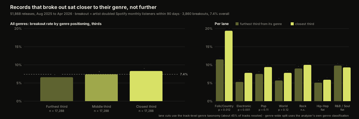
Read the second table for a second, because it's the honest shape of this. The two thirds nearest the centre are identical. It isn't that the dead centre wins. It's that the far edge loses. Being unusually far from your genre's tonal balance costs you, by about one breakout in seven.
Lane by Lane
This is where it gets more interesting, and more honest, because the effect is not the same size everywhere.
| Lane | Bottom third | Top third | |
|---|---|---|---|
| Folk / Country | 11.5% | 19.4% | p = 0.012 |
| Electronic | 5.3% | 7.8% | p < 0.001 |
| Pop | 7.5% | 9.4% | p = 0.11 |
| World | 5.7% | 7.8% | p = 0.12 |
| Rock | 9.0% | 10.0% | not significant |
| Hip-Hop | 5.1% | 5.9% | flat |
| R&B / Soul | 9.8% | 9.3% | flat |
| Religious | 9.3% | 4.9% | leans the other way, p = 0.098 |
Electronic and folk/country carry it. Pop and world lean the same way without clearing the bar on their own. Rock barely moves. Hip-hop and R&B don't care at all, which fits what those lanes told us elsewhere: R&B's growth signal was one specific band, not overall fit, and hip-hop gave us nothing stable in any test we ran. And one lane, Religious, leans the opposite direction on 545 records without reaching significance. I'm putting it in the table because leaving it out would be the kind of thing I'd want to know about if I were reading this.
So the lane-by-lane version of the claim is narrower than the headline: nowhere does sitting far from your genre help, and in two lanes sitting close to it helps a lot.
The Combinations
The lane tables are single measurements. The recipes are where this really showed up. When we searched each lane for combinations of two or three conditions that predicted growth, and then re-tested every candidate on twenty random held-out halves of the data so we weren't just fooling ourselves, genre positioning was the ingredient that kept surviving:
- Electronic: all four validated combinations include genre positioning in the top third. The strongest, with a leaner mid band and a tighter dynamic range, ran 2.4 times the lane's breakout rate.
- Rock: two of four, at 1.7 and 1.7 times.
- World: tonal deviation in the bottom third, with a darker top, 1.8 times.
- Folk/Country, records the analyzer reads as tender: genre positioning alone, 0.769 for breakouts against 0.676 for the rest, an effect size of 0.43 after correcting for every test we ran. The single biggest effect in the entire study, in a cell of 30 breakouts against 204.
And it matches what the tonal balance study found on a different measurement before any of this: breakout records were not tonal outliers. Their distance from their genre's centre was, if anything, a hair smaller than everyone else's.
The Catches
I'd rather you hear these from me than work them out later.
The per-record effect is small. A rank-biserial of 0.06 is a lean, not a lever. What makes it worth writing about is that it's the same lean in the genre-wide split, in the lane tables, in the recipes and in the published study. Consistency across four independent looks, not size.
Breakout is measured at the artist, not the track. If an artist doubled their listeners in the 90 days after a release, that release gets the credit. Growth can come from a playlist add, a tour, a sync, a short-form moment, or a different song. It's a real-outcomes yardstick, not proof of cause.
The listener history is Chartmetric's, and data is data. Sometimes the data can be wrong at the source. Their pulling system doesn't always work, and that's why I lean on my own systems where I can. Across fifty thousand records I don't think it's wrong in aggregate. I wouldn't swear to any one of them.
Genre positioning depends on the genre label. A record tagged into the wrong lane will score as far from centre when it's actually near the centre of the lane it belongs in. The per-lane numbers use track-level tags mapped through our taxonomy, which resolves for about 45% of tracks. The genre-wide numbers use the analyzer's own classification.
Size and budget were checked on the recipes and don't explain them. Small artists double more easily than big ones and signed artists more easily than unsigned; both are large effects here. The validated combinations above held among artists with over 10,000 listeners and among unsigned artists.
Correlation. Nothing here says that moving your tonal balance toward your genre's centre makes a record grow. It says the records that grew sat there. Different sentences.
How This Squares With Sounding Like Yourself
Here's the part I was most interested in, because I went into this expecting to disagree with my own data.
When I produce a record, it sounds like me. Not like a genre. Sometimes the reference lands and it's exactly like the reference and I can dial that in fine, but a lot of the time the record is what it is because I did it, not because it was genre-led. And those records found people. So when the data said "the ones that grew sit close to their genre," my first reaction was that it couldn't be describing my records.
So I checked. It sounds like me, and it also fits in the tonal balance range of the standardised genre ranges. Which is kind of interesting. I use a tonal balance meter on the master bus just as an eyeball, to see if anything's out of whack. And it never is.
That's the reconciliation, and it's not a fudge. These two scores measure tonal balance and genre fit. They don't measure what actually makes a record mine, which is how the music weaves. The interweaving of parts. The way the bass and the drums lock, the way the guitar engages with the vocal, parts moving in and out of perspective. None of that is a frequency band. A record can sit dead centre of its genre's tonal range and still be unmistakably one person's, because the signature was never in the balance. It was in the weave. The tonal balance being in-lane is what lets a listener recognise the room they've walked into. What happens in the room is still yours.
And if the mid-range sounds right, it's probably going to be right. You don't really need to push those boundaries.
The Reference Conversation
The place this lands in practice is the first conversation about a new record, and it's one I've written about before, in how to choose a reference track. Some artists come in wanting to sound like nothing else out there. That's a perfectly fine thing to want. But in 2026, almost everything's been done. So there is a reference out there, and if we can find one to dial in, that is integral to the whole thing. We need to find the reference so I can hear it. You can try and explain it to me, but in reality we need to be on the same page, because if we're not, the listener is not either.
What a match is, when it lands: it's a tonal balance thing, a tempo thing, an ambience thing, and how emotions and genre are reflected overall. That's the whole list. Notice that tonal balance is first and that "sounds like nobody" isn't on it.
That conversation is always a delicate one, and my job in it is to make the artist feel seen while we find the thing. When it doesn't happen, when I don't get the reference, it goes nowhere. We spend hours wasting time instead of making music. This data is, in a sense, fifty-one thousand records making the same point I make in that room.
What To Do With This
If you're chasing a sound that nothing else has, check whether you mean the song or the tonal balance, because the data cares about the difference. Put a reference in the session that lives in the lane you're aiming for, get the balance to sit inside it, and spend your originality on the parts that aren't measured here: the writing, the feel, the drums, the voice. If you want to know where your record actually sits against its genre's range, band by band, run it through the Sonic Analyzer; the scan is free, takes about a minute, and reports the same tonal deviation this study is built on. And if it comes back out of whack and you'd rather have a second pair of hands, here's what mixing and mastering cost, itemized honestly, or get a number calibrated to where you are from the rate calculator.

Multi-platinum producer & engineer — 19 Billboard Top 20 albums, 3.3B+ streams. Every project at Freshly Baked Studios is mixed and mastered by him personally.
Meet Alexander →Ready to Make Something Better?
Get a custom quote in 90 seconds — or book a free 30-min consultation.
19 Billboard Top 20 albums · 3.3B+ streams · Apple Digital Masters certified